A Handyman Can't Fix The Wasteland
**This is out of date, but I’m too lazy at the moment to fix it. There are more updates on the covers that I haven’t added.**
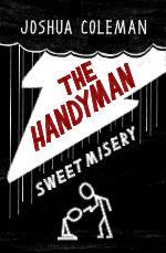
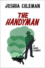
First, you’ll notice that the working title of Hammer and Wails was The Handyman. But, eventually I decided that was too generic and gave no hints to the comedic nature of the book. So it got changed. As you can see, I went through many different ideas, trying to decide what the cover should look like. In some ways, I still like all the ideas, but it’s more about what is going to grab attention the most, and would the cover fit on a shelf with others like it. Reader’s expectations of a book cover are important. I can’t say for sure if I still have achieved the perfect cover (I still have more ideas), but I finally decided on one, which you can see here.
Below are several variations of covers that I worked on.




The Inevitable Books
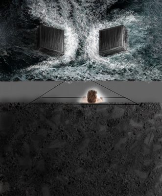
Many years ago now, I had drawn this picture in pencil after overhearing a married couple fighting. The intent was to have two ambiguous, unstoppable forces coming together with someone witnessing the inevitable destruction. Later I did a little manipulation in Photoshop to create what you see here, but this is the picture that started the idea for the book Observing the Inevitable. After drawing it, I began to develop a story in my head with no intentions of ever doing anything with it. I jotted down a few notes for fun, but that was it. Now, about 5 years later, it’s a finished novel. That certainly wasn’t the plan!
I never intended on creating my own book covers. For at least two years, I thought I was going to pursue traditional publishing, so I never considered it an option. Even when I decided to self-publish, I was still planning to hire a professional artist to draw the cover. I asked two people I knew who might be up for the job, one said they couldn’t, and I later decided the other person’s style was not what I wanted. I wanted something more photo-realistic, which got me thinking about “Photo”shop, which I had decent experience with. So I started tinkering with some free photos from Pexel.com. Eventually, I had this image, and at this time I convinced myself that I could create exactly the cover that I wanted.
The rock is a combination of a picture of mudstone and asphalt. I digitally painted the cubes and the splashing water, while the ocean is a few different pictures positioned to have the waves about how I wanted them.
I copied the asphalt image and warped it to work as a base of the cliff wall, and painted some clothes on the shirtless guy (who I never intended on actually using for the final, and I did not).
Here you can see a few succulents have also been added. These I downloaded from Pexels.com, taken by Ylanite Koppens. They were photos of house plants with a solid white background, which was perfect since I was going to remove the background and the pots they were in.
At this point, I also digital drew in the title and my name as a reference. Some basic shadows were also added to the left of the image.
More plants were added, and I began to draw cracks in the cliffside. Now, up to this point, I wasn’t sure how exactly I was going to add texture to the cliff, and wasn’t convinced digitally painting it was going to work. After a few cracks, figuring out how to make it look convincing, I decided it was going to work.
I started brightening up the image, and defined the cliff textures a lot more by drawing them in. Before I had started the cover, I found a small Wacom Intuos drawing tablet for sale on Facebook, so I bought that, never having used one before. I had never digitally drawn anything in photoshop before this, and my actual drawing skills are limited. By no means am I a professional, but mix in photo manipulation, and I am on my way!
I finally got my mom to be a pose as the person looking at the thunder cubes. I didn’t want any definable features, such as race for any of my characters, so I changed the color of her hair, and made it longer to cover her skin.
The book cover up to this point had almost no color. So I started experimenting with adding an orange light, and even some orange accents on the right side. On the left, I tried adding some blues, purples, and reds to the dark. I also decided that their was too much going on in the ocean, so I put some time in making it not look so cluttered.
Here, I finally updated the text to something presentable. I really wanted a hand written font, and so that’s what I did. I also blurred the foreground to give the image a sense of depth, and flatten some of the busy textures competing with the title.
The thunder cubes were also looking too hand-drawn, so I worked on blending the digital paint strokes, and defining the lights and shadows better.
I looked at other ebooks, and also decided to change the aspect ratio to 2:3.
I made a ton of tiny adjustments to the color, and changed all sorts of little details of the image. It took me a long time to get it to a point where I thought it was acceptable to publish. I didn’t track how long it took, but it probably took anywhere between 50-80 hours.
I updated the title and my name again, saturated the color more, brightened it up a little more and eventually decided that I was happy with the result! I changed it a little more after seeing my paperback proof copy.
Then! Another change to the title. After staring at the cover for several months, I finally decided that my hand written font wasn’t good for a book after all. So I went with a much bolder font to better invoke the emotion of the book.
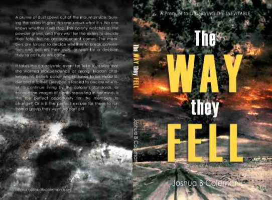
The Way They Fell Cover
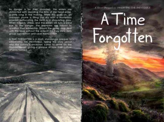
This is the full paperback cover of The Way They Fell. However, I had a completely different cover before this, with a completely different title.
Before the title became The Way They Fell, it was A Time Forgotten. But that title was already taken, and didn’t clue in first time readers to what it could be remotely about. So it got changed. About the same time I changed the title, I decided the cover needed to be more grabbing, too. So I reworked the old back cover to be the front, and added color to it.
What you see here was a work in progress, but mostly complete (until it got axed). It consists of many layers, if not more than the current one, and well, it was a lot of time spent on something I didn’t use. Such is the book business I have learned…
This is the cover without any text or darkening overlays. I wanted to have this ominous sense of doom, and I think this image is pretty dramatic. The footsteps in the dust was something I thought appropriate foreshadow, though most people won’t see it since they’ll only experience the digital versions of the book.
All the color was added last. The front cover has a few different color layers of red, orange, and purple to give it that gradient. It also has some levels and curves to make it pop.
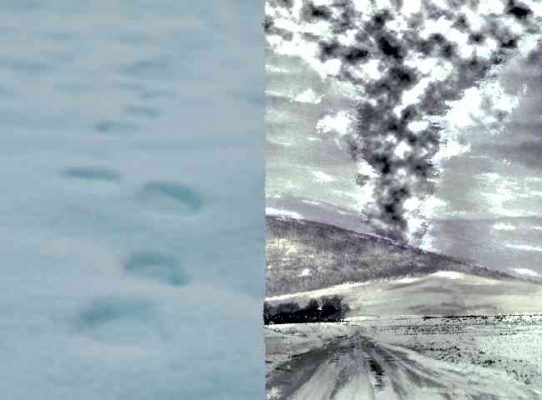
As for the back cover, I found a free image on Pexels.com of some footprints in the snow. They became the base of my footprints in the dust, to which I added the drag. I went with more of a grungy, imperfect look for the style. I believe the snow image was by Tobias Bjørkli.
As you can see, the snow image is kinda blue…which didn’t work so well for my grey dust, so I turned it black and white and played with the contrasts.
The plume consists of several layers of Photoshop brushes, and clouds rendered by Photoshop (I have since canceled my monthly subscription and purchased Affinity Photo). Somewhere in the plume is also an image of some clouds with sunlight shining through to give me a base of how the light would look hitting the plume from the back.
The road and tracks were also drawn in with a digital brush, and some dust added on the few trees.
My main goal in the starting image was to have a field and layered mountains. This was the best image I could find. So I used the clone tool to remove the church from the image, and drew a few more brush strokes on the hills to give it a grungier, drawn look. There is also a vineyard I think on the first hill, so I needed that to go away.
This is the original image. As you can see, there wasn’t much sky in the image, so I cloned it several times to get the length I needed. It kind of gave it a layered cloud kinda look, so I went with it. Of course, most of the sky got covered up with other brushes. The photo is by Dominika Gregušová.


